Mobile App design concepts utilising Google Material design
CLIENT
Diageo
DURATION
2 week design sprint
CORE CAPABILITIES
Ideation / Product Design
Sketch App
Overflow.io
The Challenge
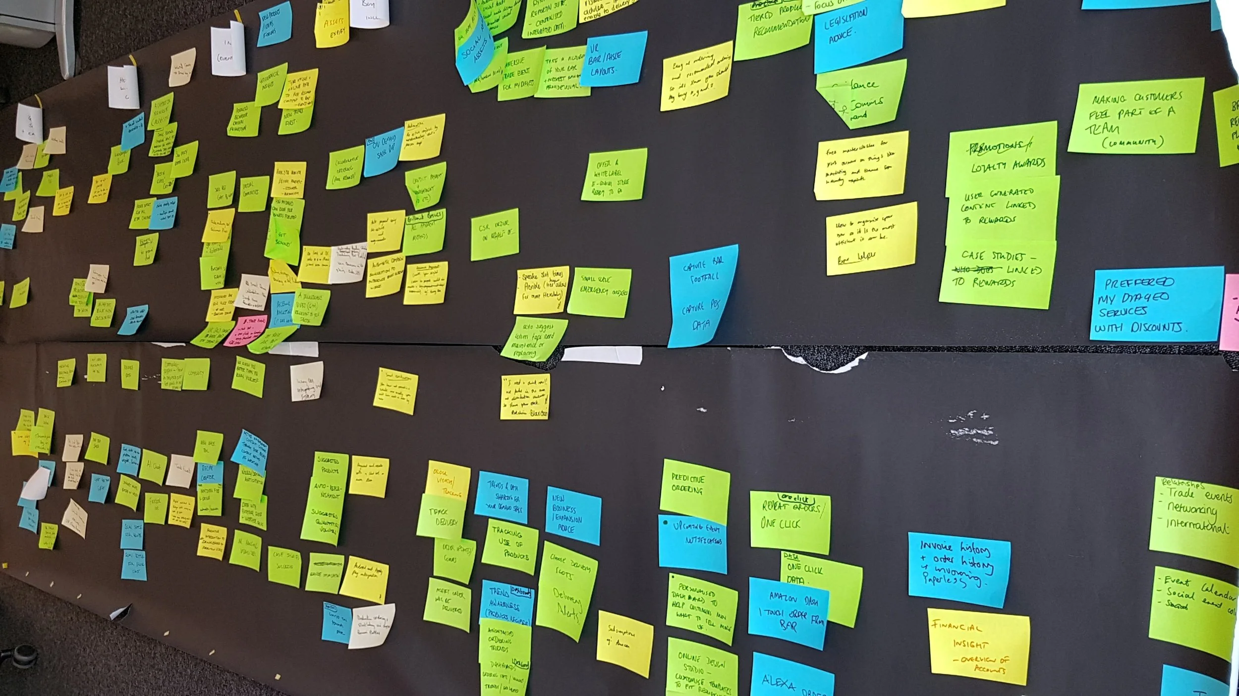
To follow on from a team/client proposition workshop I helped facilitate, we needed to progress the functional themes highlighted into something more tangible. The goal was to help communicate the future direction of an App proof-of-concept to senior stakeholders at Diageo.
Ultimately the App would be used by Diageo's Trade partners (who we researched for a previous project) to help them manage their outlets more effectively and build a better relationship with Diageo.
How it was accomplished
1.
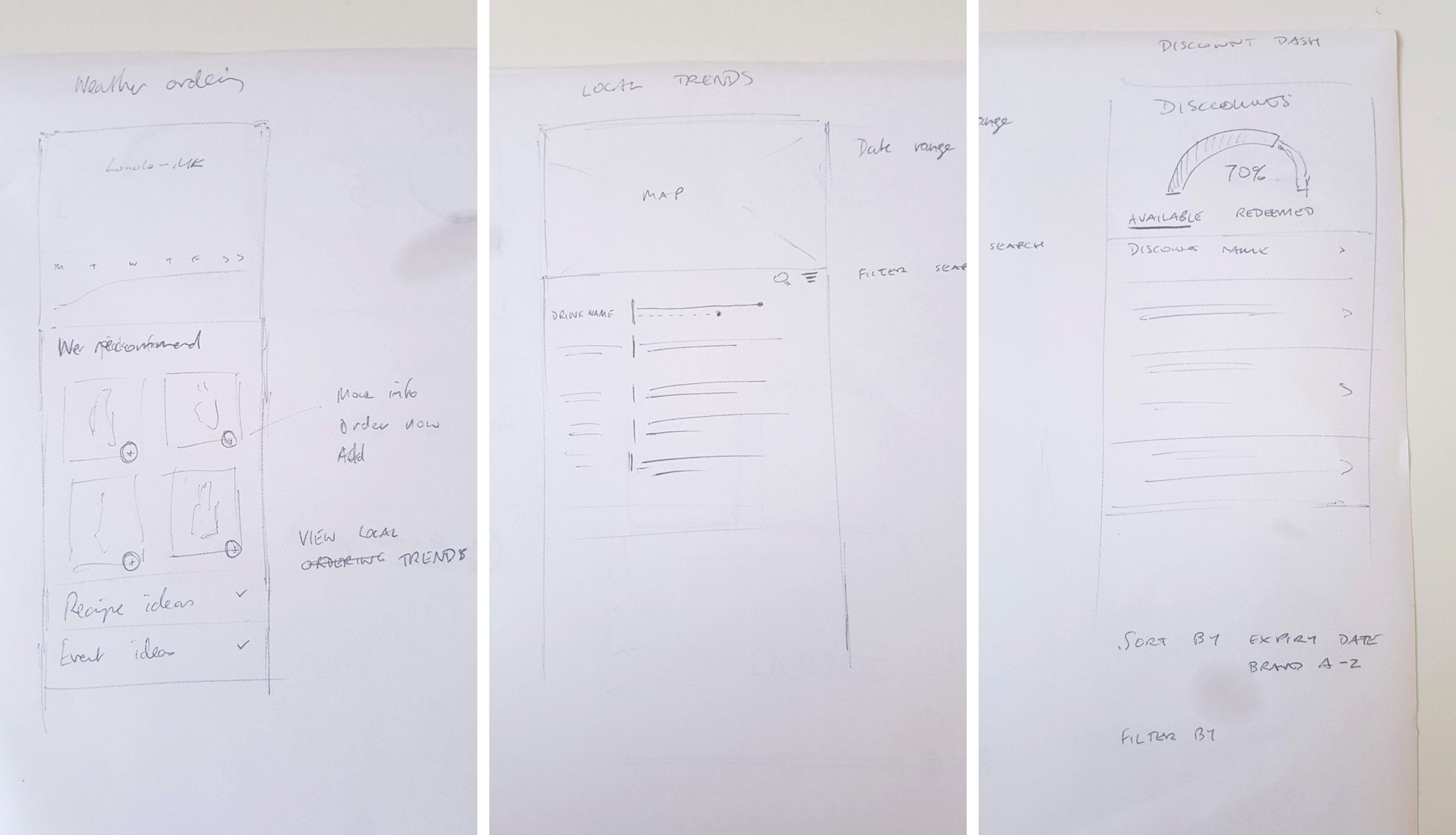
Initial sketches were created to expand on the key functional areas that could be woven in to a user journey. These then allowed conversations to take place to ascertain what data would be needed, if it would be possible to build, and whether it would meet the needs of the business.
Due to the limited publicity afforded to this POC, testing with real users, although advisable, was not possible at this stage.
2.
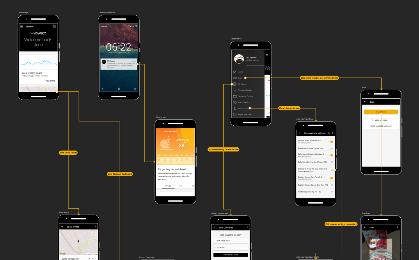
User journey flows were sketched out on paper first before being realised using overflow.io once the screen designs were complete. This was my first attempt using to this tool, it has a really simple integration with Sketch and provides a easy way for non-designers to navigate each diagram or view as a clickable demo. Much more effective at communicating the user journey than a pdf.
A key consideration of the app was to cater for a balance of task focussed interactions, where a user has a specific goal to accomplish using the app and more inspiration based usage where they have more time to spare in their daily work routines.
3.
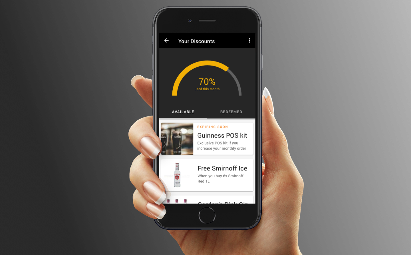
The main screens and navigation menu were designed in Sketch in parallel with developers working on more complex functionality such as a barcode scanner to re-order stock.
Using the Google Material design Sketch plugin the amount of time needed to create the screens was reduced and the consistency was improved, removing the need to hand craft all the design elements from scratch. It also provided a rapid development path for developers (using the Ionic framework) where the designs could easily be made into viable code with few front-end customisations.
Another advantage of using a design system like this is that users will be familiar with many of the elements from other apps they already use. We knew from prior research that these business users were familiar with products such as Google Drive and use their mobiles for work as well as personal use.
The Outcome
This visualisation piece was used in discussions to secure future funding and commitment to build the app. A fully working demo was also built showing the barcode scan/re-order capability in action.